Client: Daymi
Role: Graphic Designer
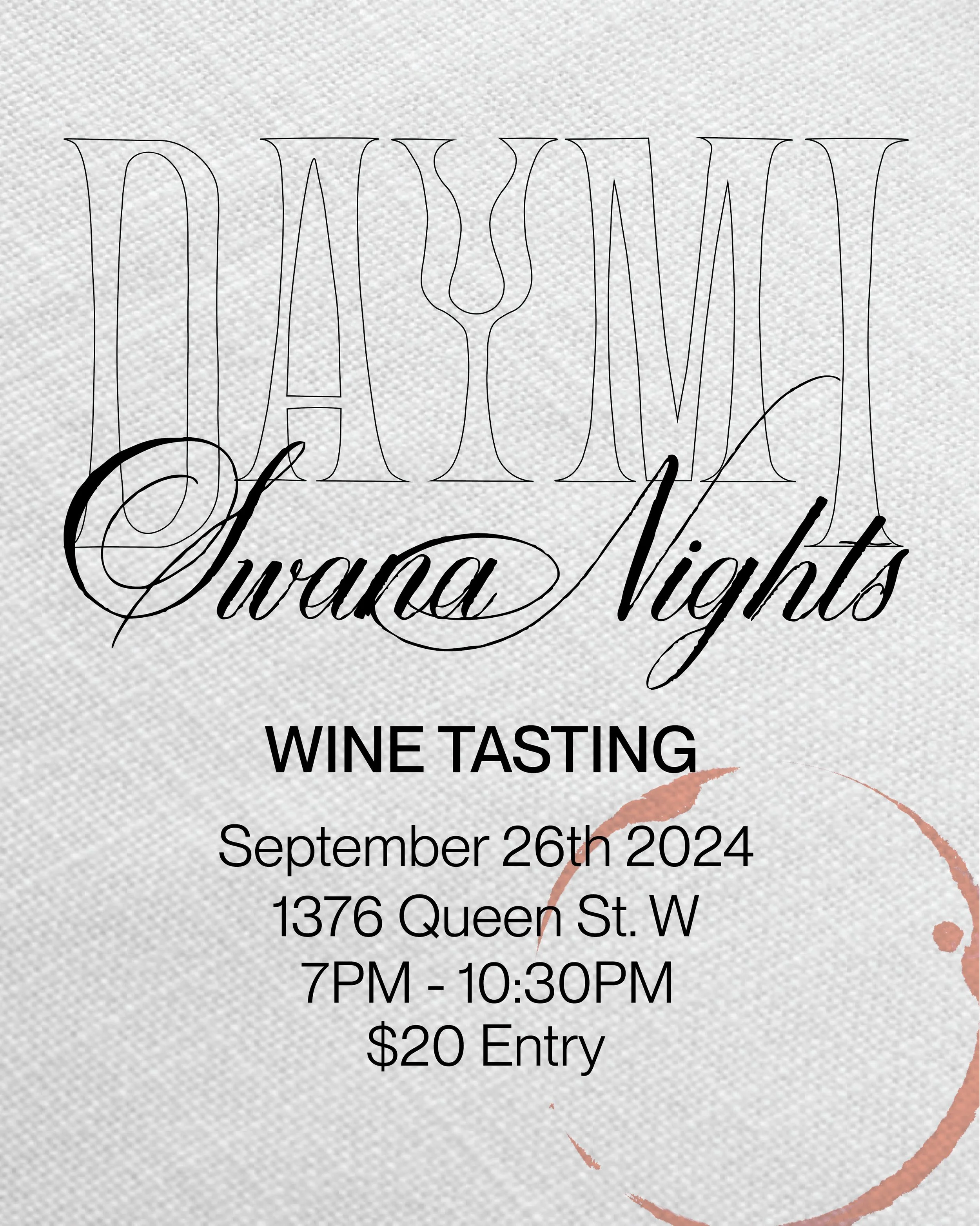
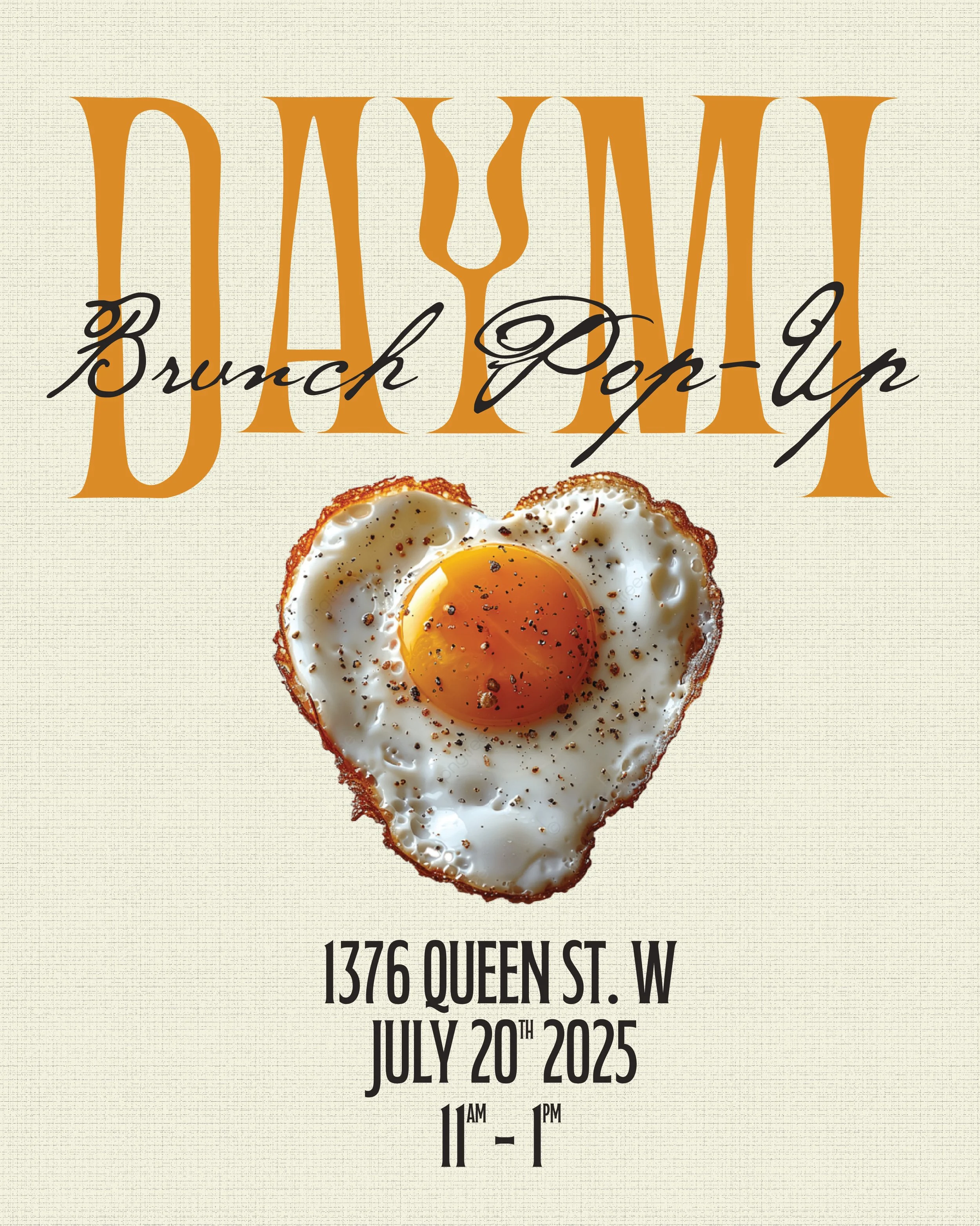
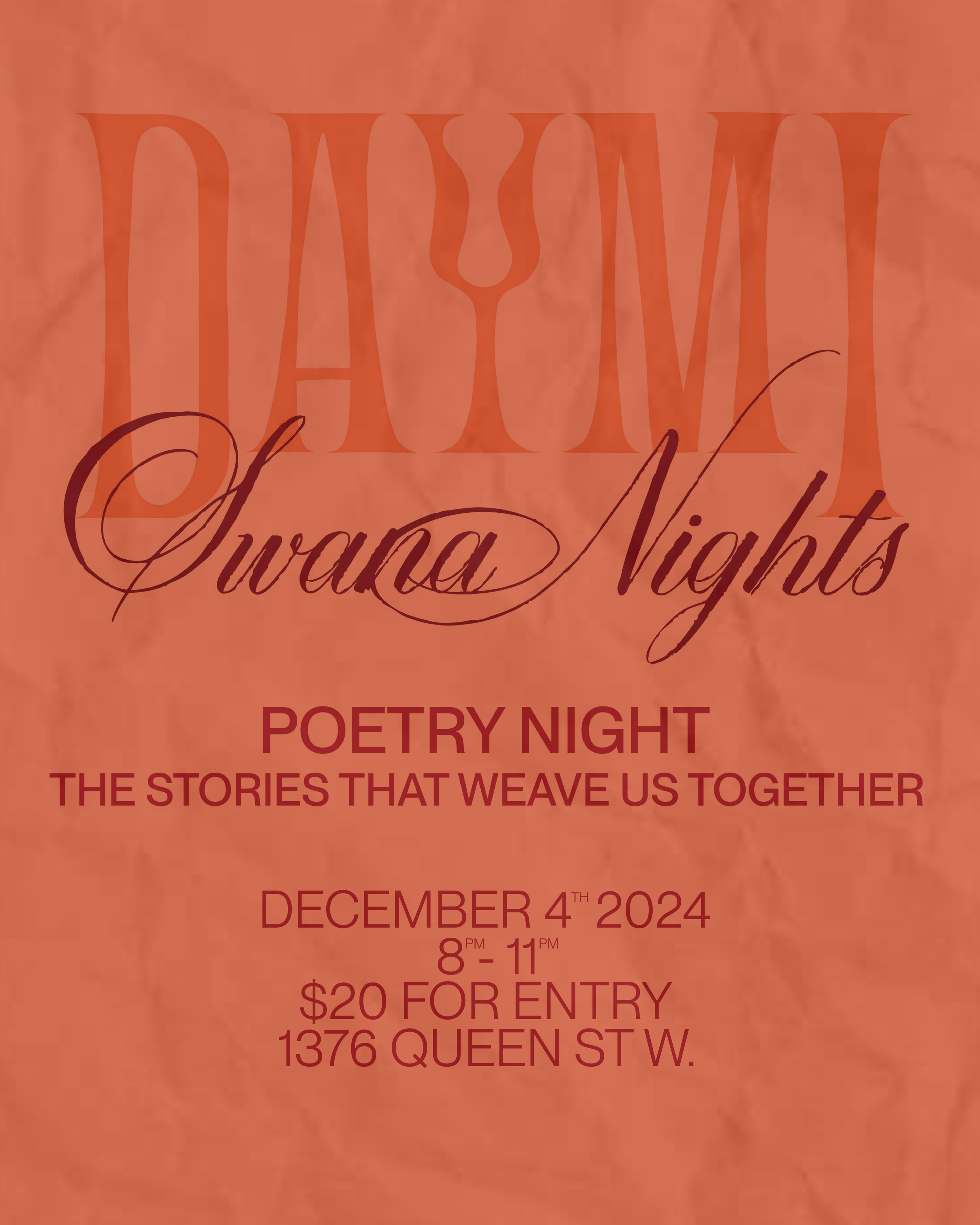
Daymi is a traditional Lebanese restaurant that is home to delicious quick eats, all from a family’s recipe book. Daymi’s vibrant space is not only limited to good eats, they frequently host intimate events that bring the community together.
I was hired to design the monthly event posters - both physical and digital. The visual direction was crafted to reflect the restaurant’s contemporary, culture-forward identity while also emphasizing the intimate, community-driven atmosphere of the events.
Client: Kin
Role: Art Director, Designer, Creative Strategist
Kin is a homegrown skincare brand that is gearing up to enter the health and beauty space. Kin prides itself on inclusivity and offers a mix of skincare products, all catering to people of various skin types.
The team at Kin tasked me with creating their brand identity, designing the packaging for their products, and spearheading their campaigns. Given that inclusivity is a huge part of the brand’s identity, I created the slogan “for all skin types” which cleverly incorporates the brand’s name into their mission statement. Inclusivity also influenced the “for all skin types” campaign, featuring models with stretch marks, acne scars, and skin imperfections, showcasing who would benefit from using Kin products. This form of representation also allows consumers to form a kinship with the brand, creating a stronger emotional connection while reinforcing the brand's inclusive values.
Client: 777 Dim Sum
Role: Art Director, Graphic Designer
777 Dim Sum was a pop-up restaurant hosted at Trinity Bellwoods in Toronto. Orchestrated by two friends with a love for incorporating a modern approach to traditional Chinese recipes, the duo wanted to host an event that allowed them to showcase their skills in a cookout styled community event.
Entrusting me with task of giving life to their idea, I was brought on board to create the pop-up’s brand identity. My goal was to create a modern and stylish look that also captured their cheeky personalities. Once the menu was curated, I was able to design around it. I came up with the slogan, and built the rest of the brand’s elements around it. Aside from the digital posters for social media, I also designed physical posters, as well as stickers and t-shirts that were sold at the event.
Client: Automara
Role: Art Director, Graphic Designer, Photographer
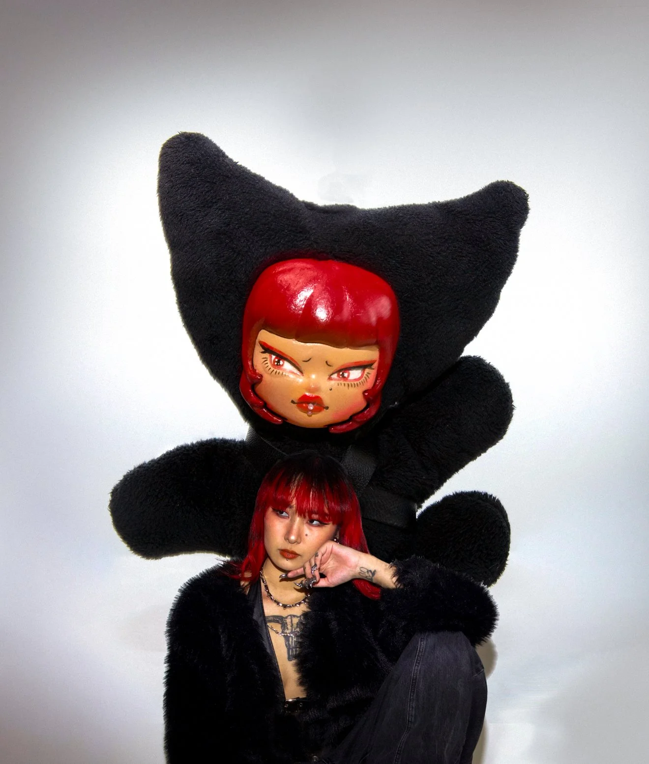
Automara is a designer that utilizes 3D printing to create futuristic yet functional avant garde pieces. Adding to their line of bags and sculptures, was a new series called Mini-Mara, which features customizable, hand finished, one-of-a-kind plush pendants.
I was hired to design the Mini-Mara campaign alongside Kerry - the creator of Automara. For this job, I photographed the campaign and co-designed the posters. Kerry presented me with a mood-board of how she envisioned the campaign to look, and then allowed me to design the campaign in a way that was cohesive and incorporated elements from the mood-board, forming a distinct design with it’s own identity.
Client: AQF (A Question for You)
Role: Graphic Designer
AQF is a platform that connect strangers together through anonymous voice notes, messages, and chatrooms. Their social media presence features individuals being asked intimate questions as viewers can listen, relate, gain new perspectives, and ultimately feel more connected with one another.
I was hired to create promoted ads for social media (Instagram, TikTok, Facebook). Faizah (founder) requested the posts to be flashy, colourful (featuring the brand’s colour palette), and ambiguous so that they draw curious audiences to AQF’s socials and website. All animations were created by me.

Client: Medulla Marketing Solutions
Role: Graphic Designer
Medulla is marketing agency that specializes in supporting minority-owned businesses with high-impact marketing solutions.
I was reached out to create the agency’s logo. I was given a rough sketch of the what the logo should look like - two bold lines stacked on top of one another. I found the bold lines to be forgetful and generic, so I designed them to be tapered towards the end. This design looks sleek and professional, and it will look good on the agency’s merchandise.